Knot (Family Historian Thesis)
<!--
Work info
-->
Client:
Thomas Jefferson University
Role:
UI/UX Design
Year:
2025
Project Overview
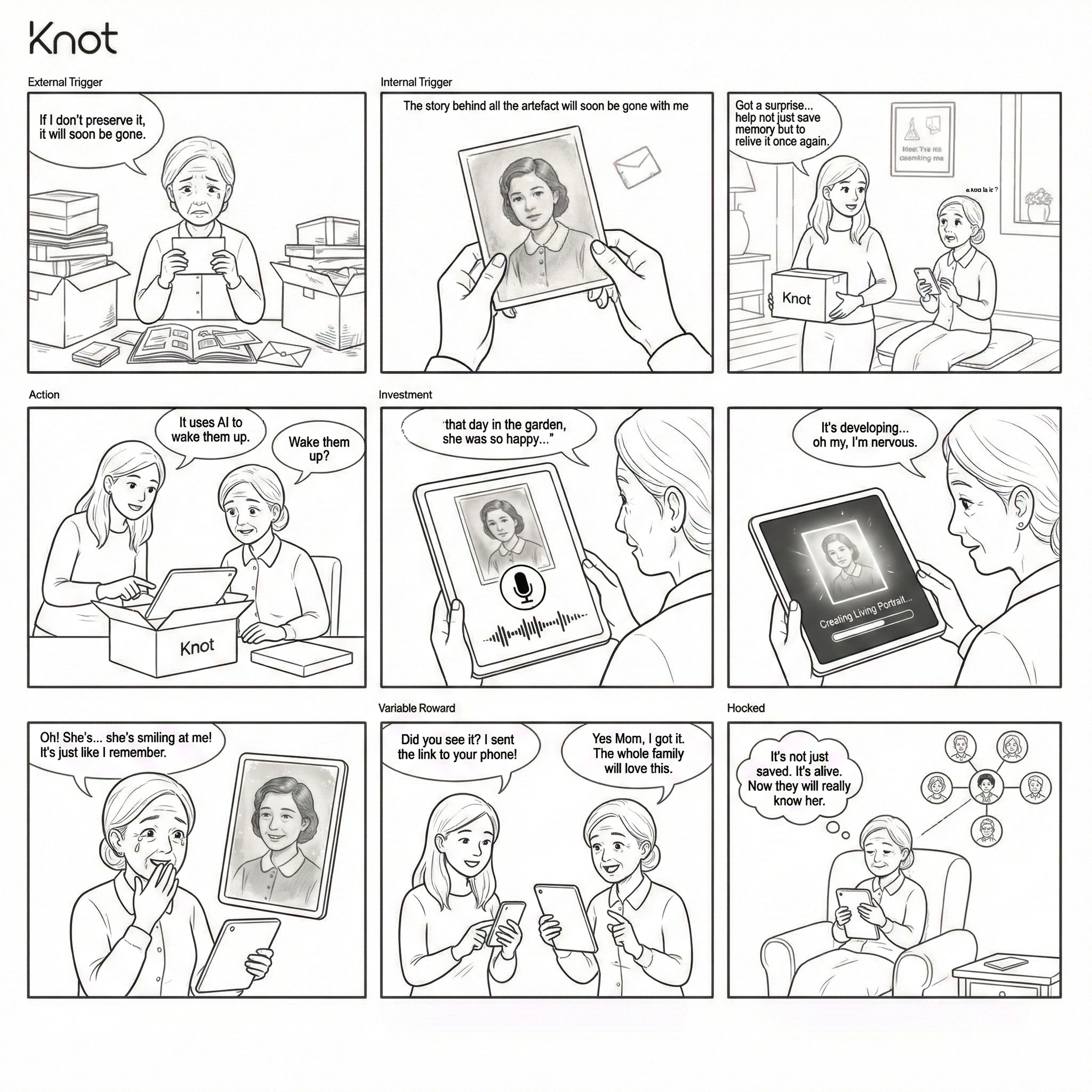
The Story of the Family Historian is a thesis exploring why families lose meaning, not photos. As memories scatter across devices and generations, the stories behind them fade, leaving silent, static images. Knot is an AI-powered platform that animates archival photographs into living memories, paired with voice-first storytelling, designed specifically for older adults, the unwitting keepers of family history.
Discover
The Problem:
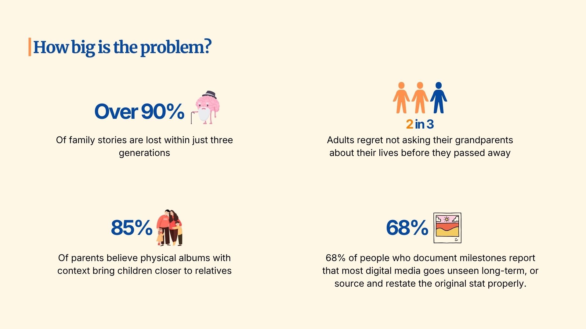
Over 90% of family stories are lost within three generations. 2 in 3 adults regret never asking their grandparents about their lives before they passed. The crisis isn't that people stop taking photos; it's "context decay": a photo survives, but the voice, the date, the joke, the reason it was taken don't. Knot calls the person carrying this burden the Family Historian: usually 50+, surrounded by photos that no longer speak, afraid that the history ends in silence.
Research Plan:
Before speaking to a single participant, I committed to four objectives rather than a feature wishlist, so the interviews would surface behavior instead of preference:
Understand emotional and psychological barriers, not frustration, but the deeper fear of forgetting before being ready.
Map the analog-to-digital journey: where do people get stuck, and what have they already tried and abandoned?
Uncover current workarounds, what imperfect tools and habits have replaced a real solution.
Evaluate willingness to delegate, and trust that people will hand something irreplaceable to a system they don't know?
12 Moderated Interviews + Stakeholder Interview:
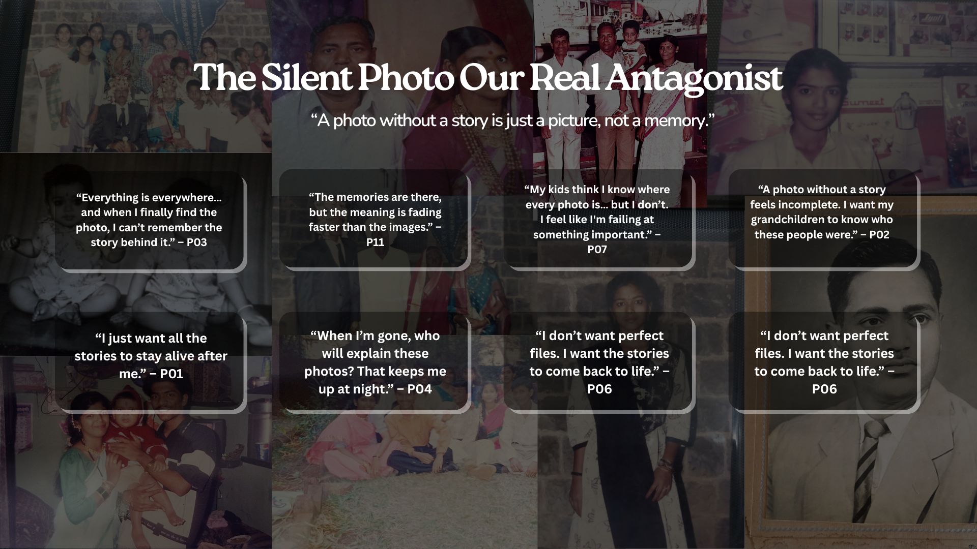
12 participants across age groups and family structures, interviewed individually, patterns were mapped only after all 12 were complete, to avoid early themes biasing later questions. Five themes recurred independently across every participant:
Physical damage is already happening, not a future risk. 10 of 12 had already permanently lost at least one irreplaceable photo.
Every digitization attempt had already failed. All 12 had tried photographing prints with a phone. All found the quality unacceptable and abandoned the attempt.
The deepest motivation is always someone else. Preservation was never framed as personal nostalgia; it was about a grandchild, a son who never met his grandfather, a legacy to pass down.
Organizational systems collapse under volume. People search for memories by feeling and story ("the day my son came home from the hospital"), not by date or filename, and every folder-based system failed because of that mismatch.
Trust is the first barrier, not technology. Fear of hacking, misuse, and AI manipulation of family photos came up unprompted and repeatedly. This became the most consequential finding in the whole study: every feature had to earn trust before it could demonstrate capability.
I also interviewed a professional photo restorer (18 years in the trade) as a stakeholder, not for technical input, but because he was the person families already trusted with their most irreplaceable images. His framing reset the entire project: "Some people come with photos of parents who are no longer with them. They say please handle them with care." Knot stopped being a tool for organizing photographs and became a system for earning that exact kind of trust.
Synthesis: The Journey Map
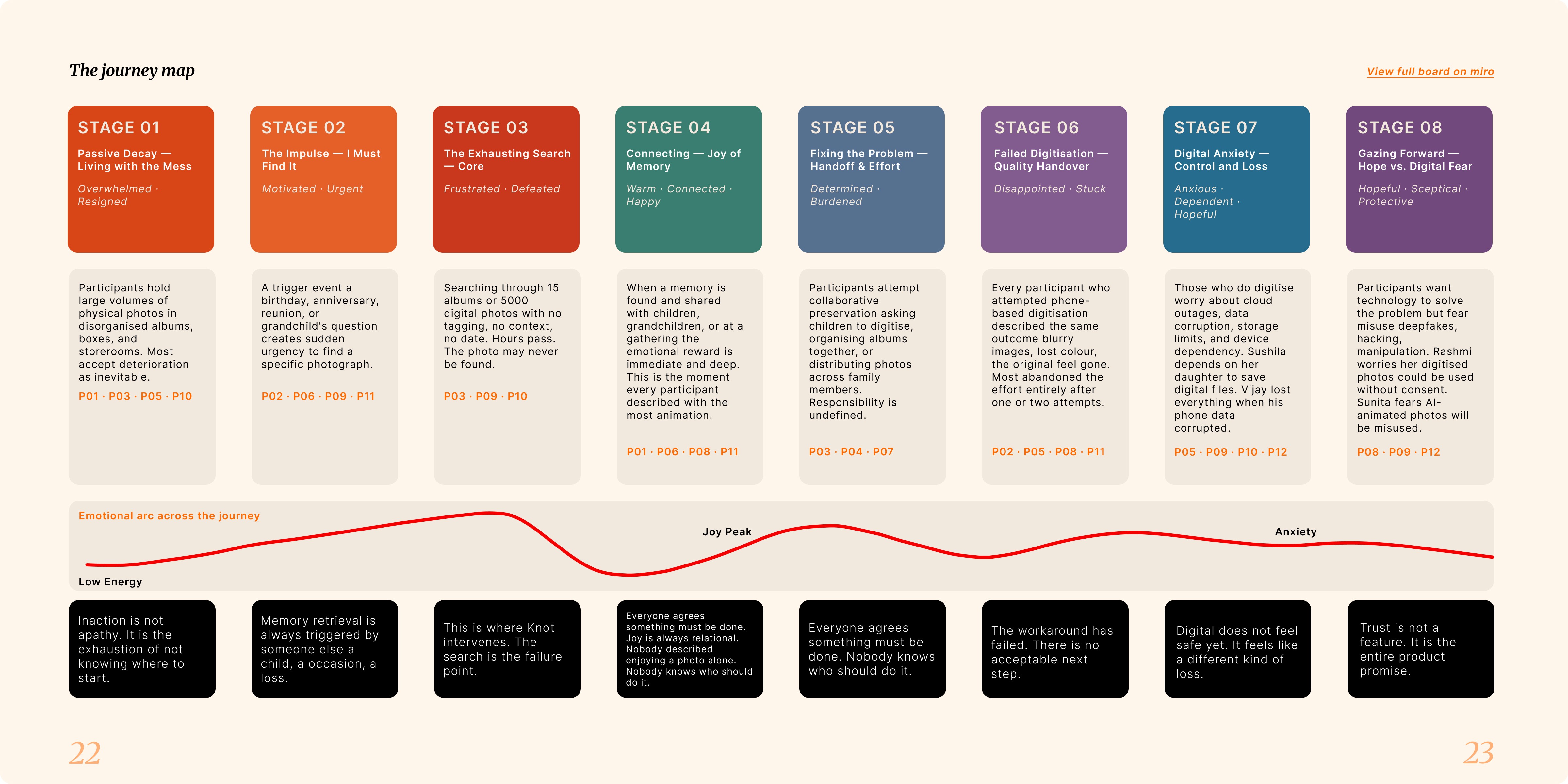
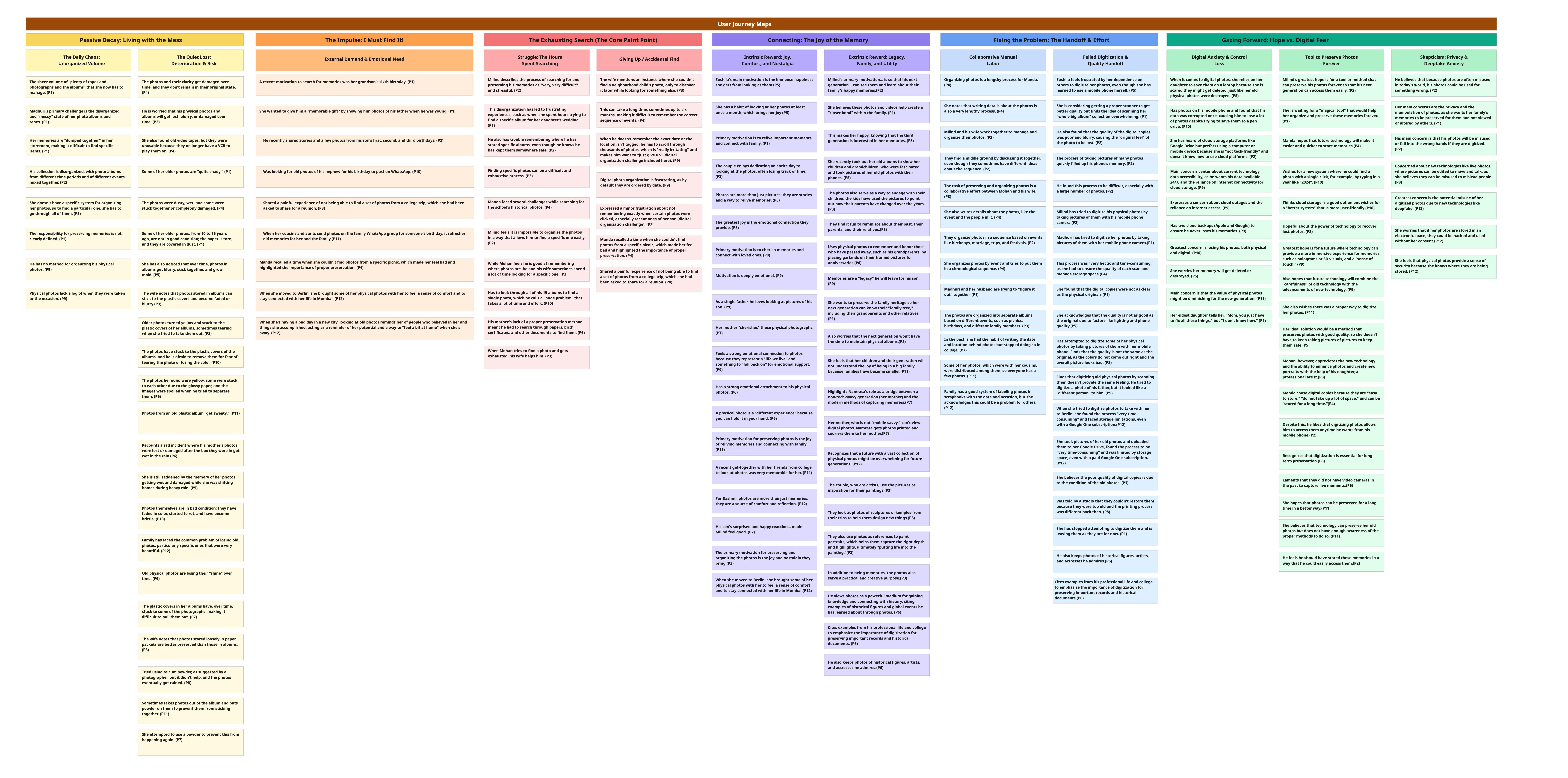
Synthesizing all 12 transcripts revealed an 8-stage cycle, not a linear funnel: Passive Decay → The Impulse (always triggered by someone else, a birthday, a grandchild's question) → The Exhausting Search (where every existing tool fails) → Connecting (the genuine joy peak, and the product's actual promise) → Fixing the Problem → Failed Digitization → Digital Anxiety → Gazing Forward (hope and fear of technology, simultaneously). The product had to be designed backward from the joy at stage 4, not forward from the mess at stage 1.
Define
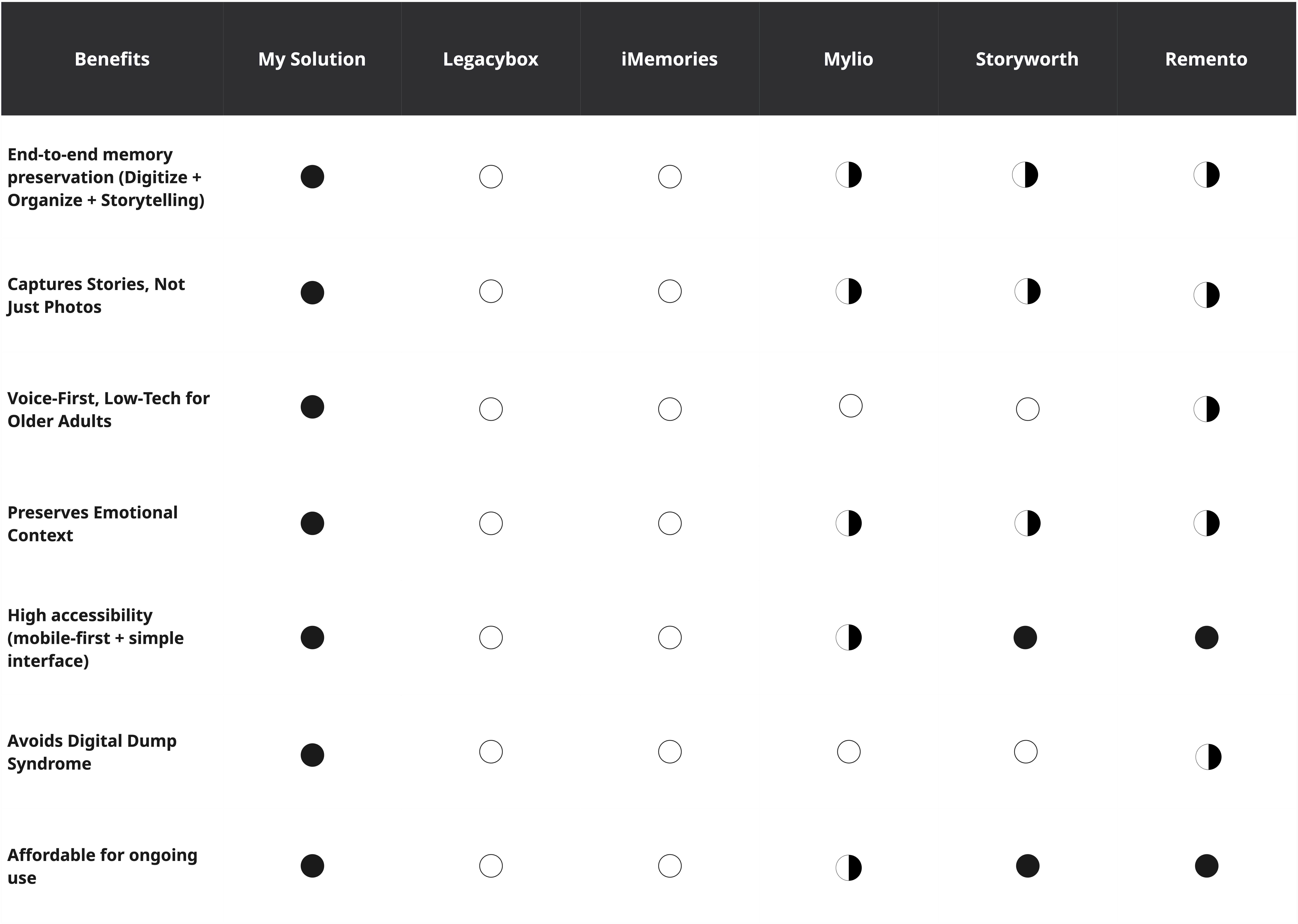
Competitive Analysis
Compared against Legacybox/iMemories (excellent physical digitization, zero storytelling or organization after delivery), Mylio (strong digital library tools, built for photography enthusiasts, not first-time older adult users), Storyworth (captures stories, but through writing, the wrong medium for this population), and Remento (closest competitor, voice-first capture linked to photos, but no physical digitization and partial accessibility coverage).
The finding that mattered: every competitor solved two dimensions of the problem well and ignored the other two. No single tool integrates digitization, organization, voice-first storytelling, and the preservation of emotional context. That fragmentation, not a gap in quality, is why Knot needed to exist as a single integrated system rather than as a better version of any one competitor.
Two Personas: User and Buyer Are Different People
Margaret, 74, retired teacher. Low-medium tech proficiency, arthritis makes typing painful. "I just want to talk." This single line gave rise to Knot's voice-first architecture: every interface decision that removes typing from the critical path traces back to her.
Sarah, 51, Margaret's daughter, high tech proficiency, no time. Carries the guilt, has the money, lacks the hours. "I'd pay anything for someone else to just handle this for me." This shaped onboarding: the setup had to be something Sarah could complete in minutes and hand off to Margaret, because if the initial configuration required Margaret's involvement, Sarah's guilt would turn to frustration rather than relief.

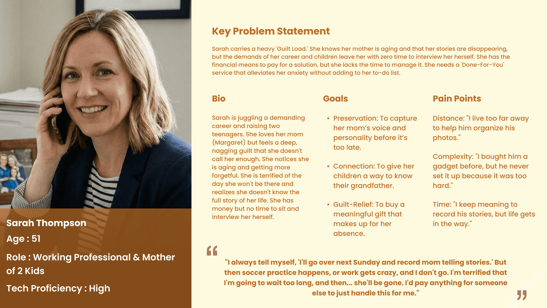
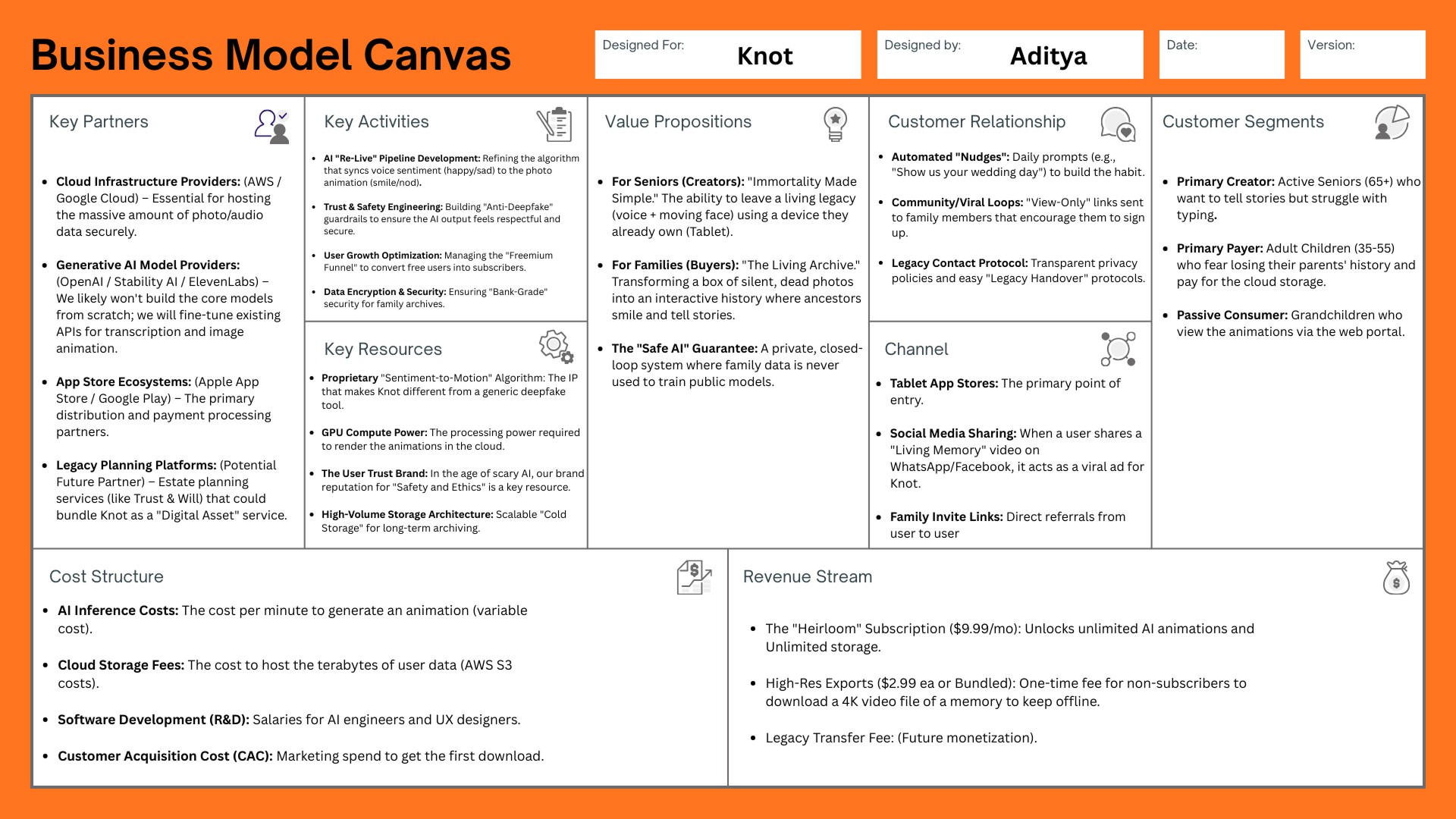
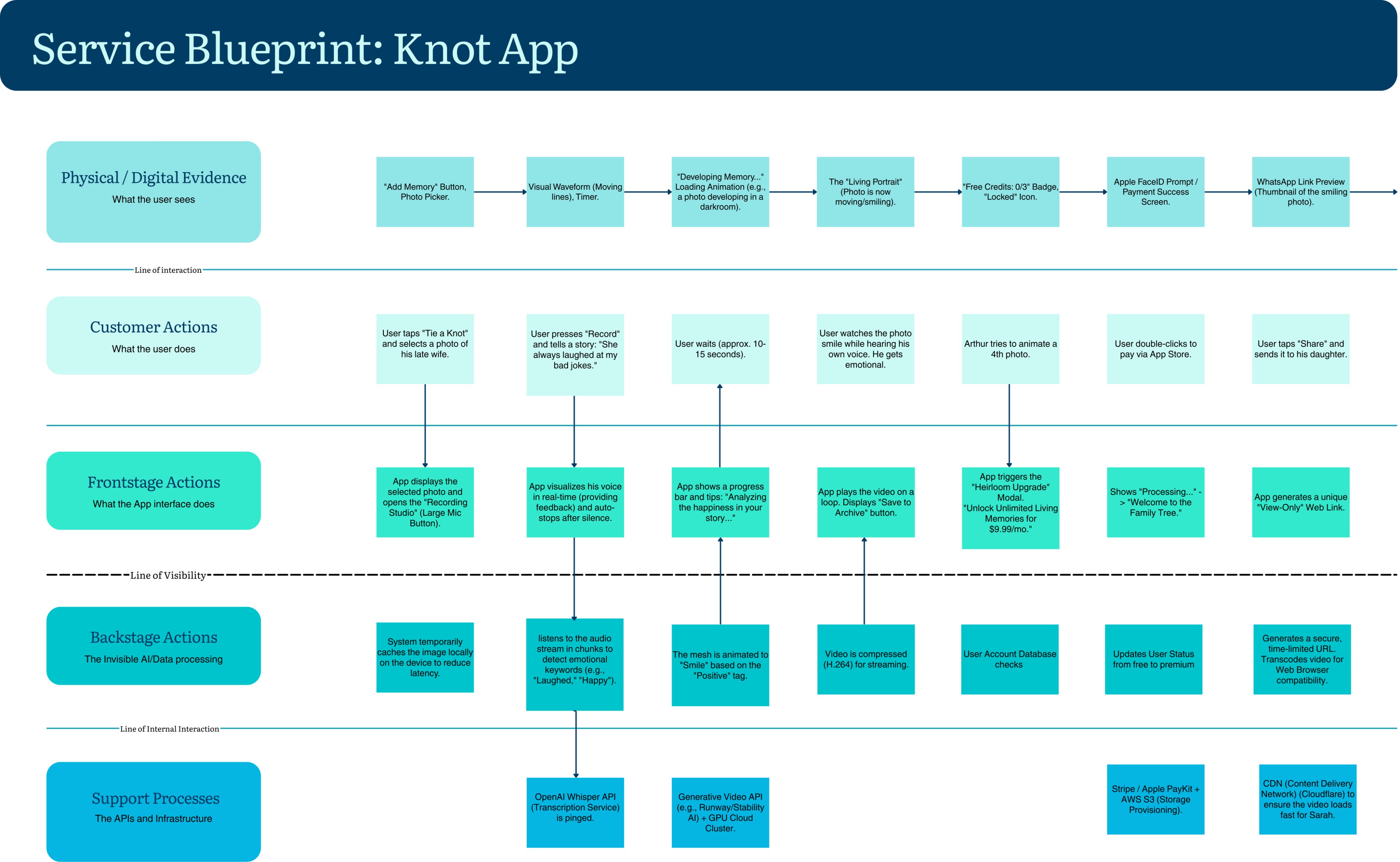
The relationship between the two personas is the growth strategy: Sarah buys and sets up, Margaret records, Sarah receives a shareable Living Memory link and passes it to her children. The product spreads along the family's existing line of trust.
KPIs & KEIs
Business health and design health are tracked separately on purpose, since a product can convert well while still failing the people it was built for.
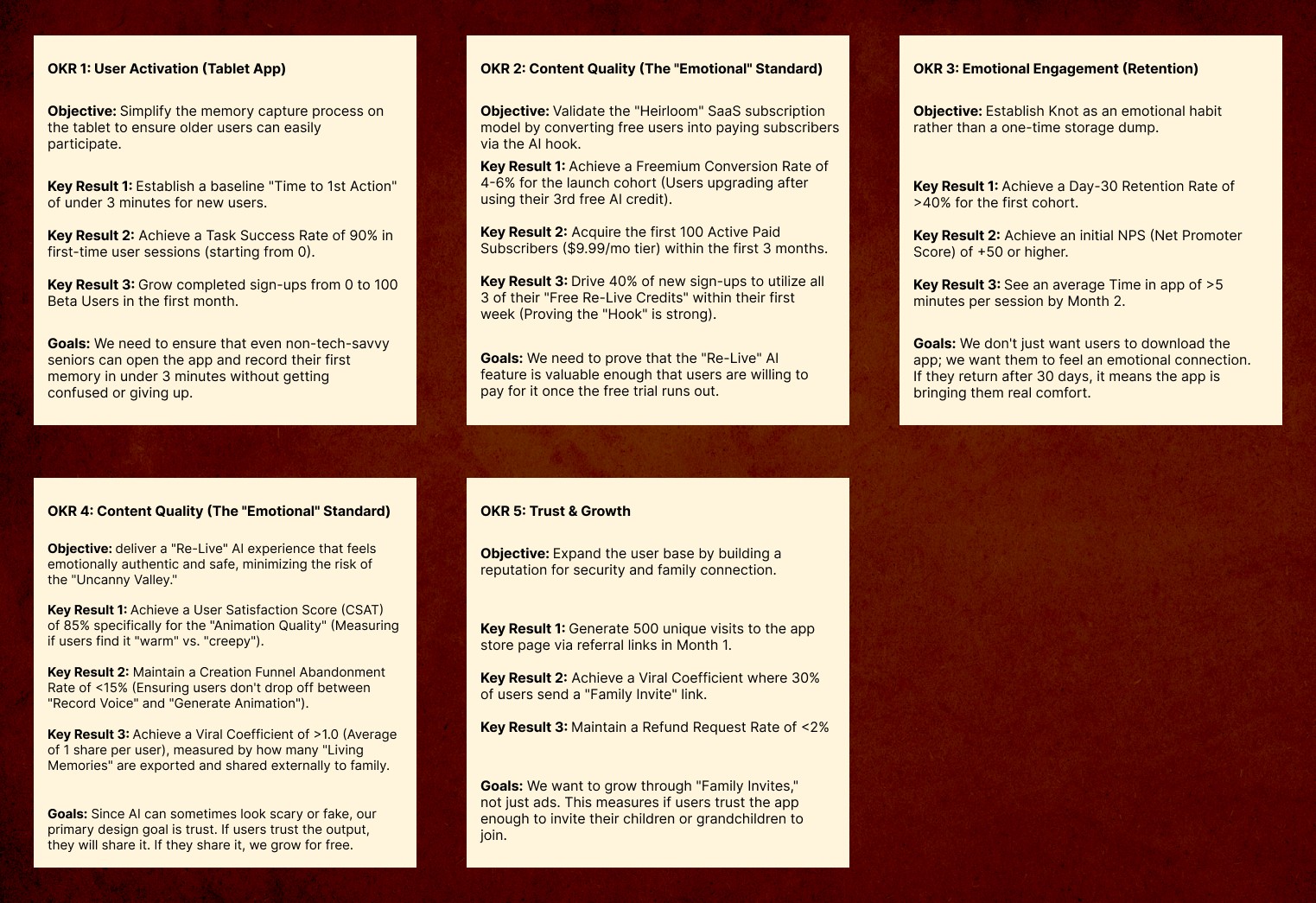
OKRs
Five objectives, sequenced deliberately: activation before conversion, quality before growth, trust before scale. The most telling one: a Day-30 retention rate above 40% wasn't treated as an engagement metric; it was treated as the threshold where the app becomes part of someone's emotional life rather than a tool they tried once.
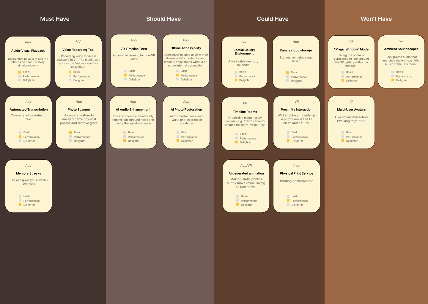
Scope — MoSCoW
The hardest calls weren't in the Must-Have column (voice-first capture, photo animation, and a guided onboarding were never in question). They were in the middle: deciding that institutional partnerships and a full Family Companion feature were a " won't-have " for V1, deferred until trust and activation numbers justified scaling.
Develop
Visual Direction: Why "Commonplace"
I tested four distinct moodboard directions before choosing one: Simple (Zen-adjacent, stone and linen, clinically clean but cold), Discreet (privacy-forward, blurred and intimate, but read as melancholic for a product trying to make memories feel alive), Quiet (tonally mixed, contributed the deep navy used in type), and Commonplace (warm earth tones, cream, olive, a single orange accent, the feeling of a kitchen table or a worn bookshelf). Commonplace won because it was the only board that felt inhabited rather than curated, and the research kept pointing to the same truth: the memories people most wanted to preserve weren't extraordinary; they were ordinary moments made extraordinary by time. The cream background, navy text, and orange accent across Knot's entire interface descend directly from this board.

Information Architecture
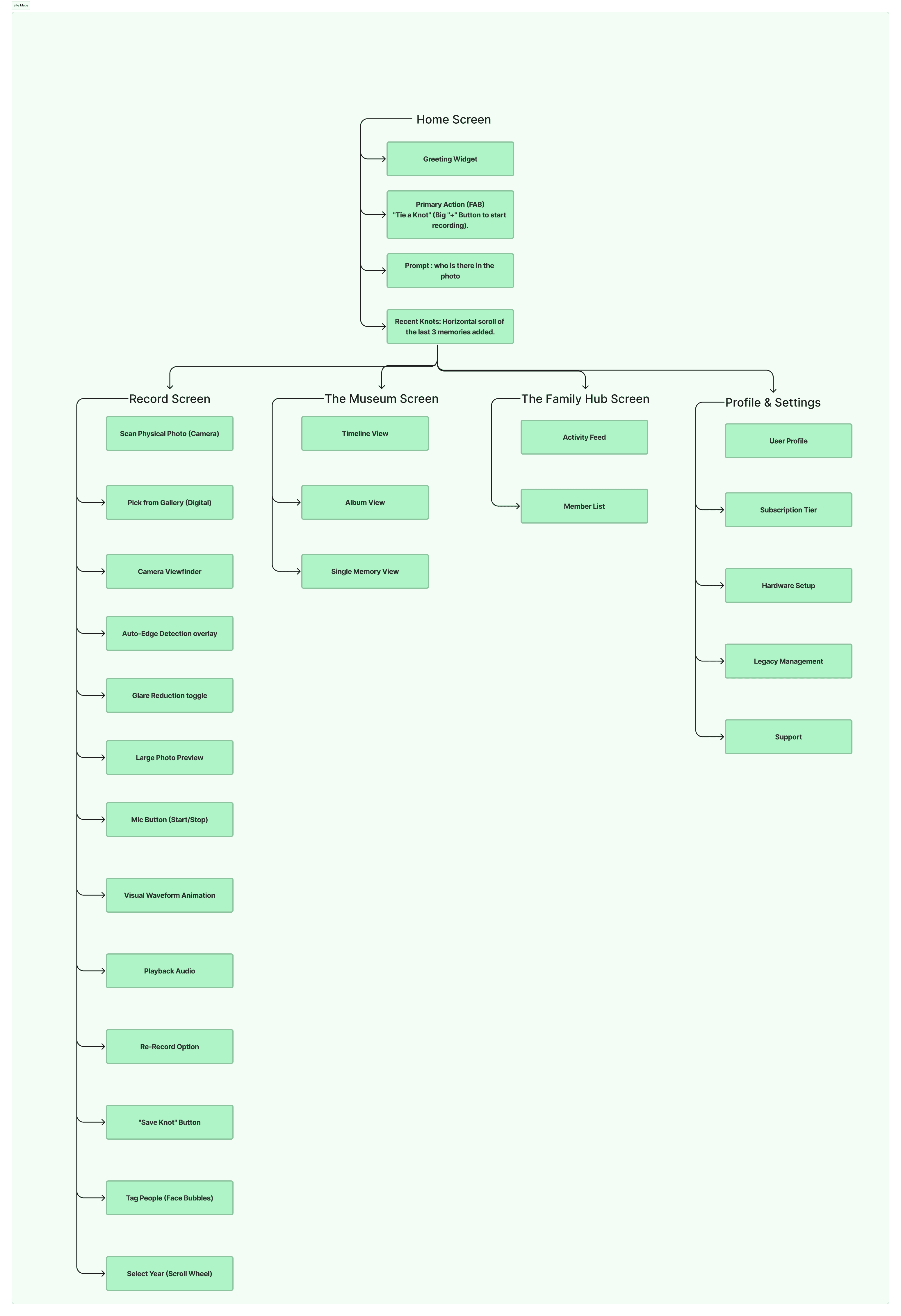
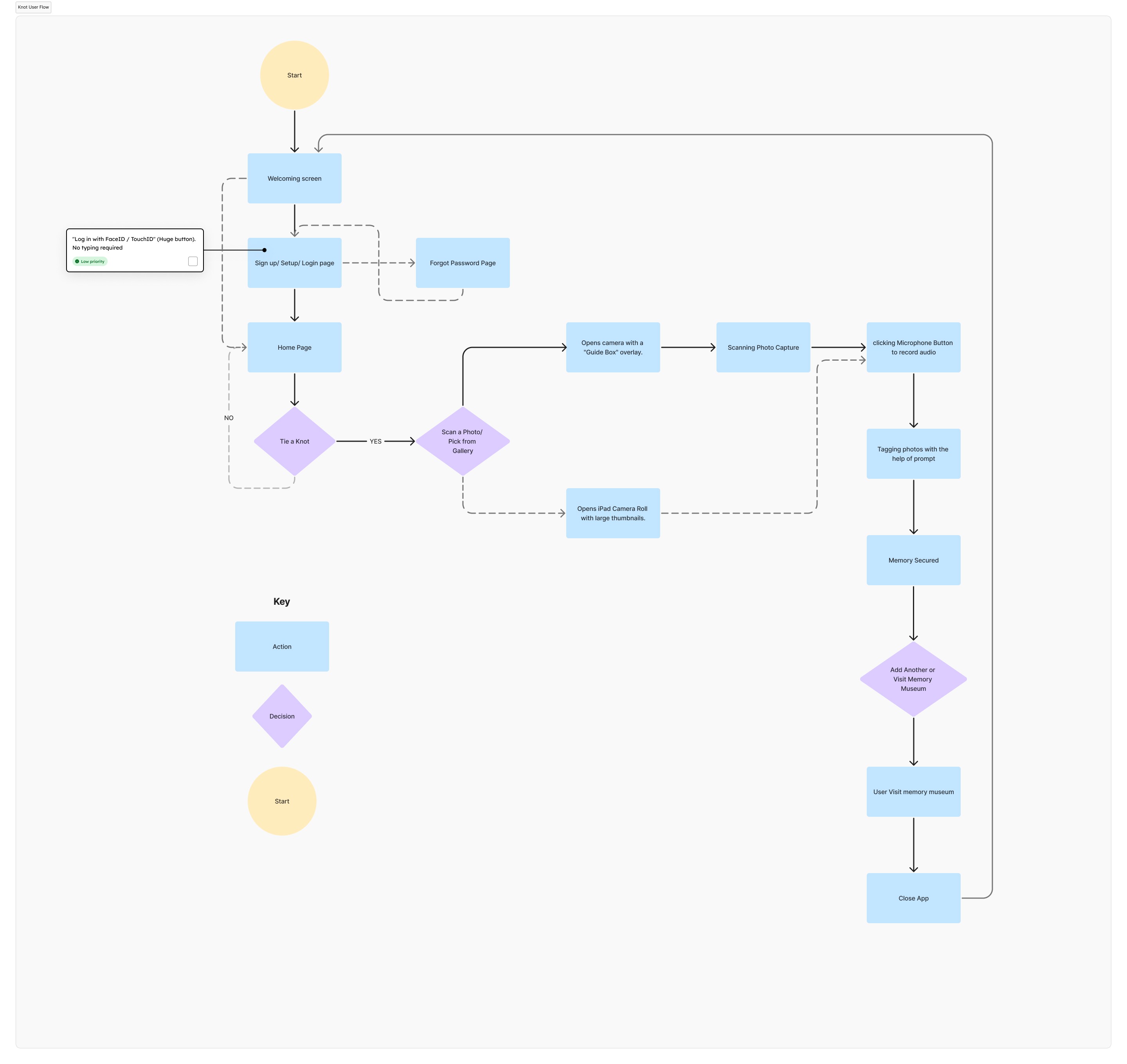
Five top-level sections (Home, Record, Museum, Family Hub, Profile), built around one governing principle from the research: people navigate memories by feeling and story, not by folder or date. The Museum is organized by timeline, not album. Record is a top-level destination, not buried in a menu, because creating a memory is treated as equally important to finding one. No path in the product requires more than two taps to reach significant content.
Annotated Screens: Decisions Traced to Findings
Year-only scroll wheel, not a full date picker. Testing showed full date entry caused visible anxiety; participants remembered the year, not the day. Reduced cognitive load from 3 fields to 1.
Decade timeline as primary navigation, not folders or filenames. Matches how participants actually described searching: "that was in the 90s," not a file path.
Download the icon on every memory row. Added after research surfaced unreliable internet access as a real constraint for this age group, not a hypothetical one.
72-point microphone touch target. Originally framed as an accessibility accommodation, reframed during the program as simply the correct size for any finger in any context.
Sign-up surfaced as the primary action, login secondary. 4 of 5 usability participants landed on login first and couldn't find sign-up. Fixed directly from that finding.
Subscription tiers named "The Hook Plan" and "The Living Archive," not "Free" and "Premium." Names describe what the user gets emotionally; they are chosen to earn trust before asking for payment, per the research's core finding that trust precedes everything else.

Deliver / Result
This section is currently empty on the live page. It shouldn't be, you have three separate validated experiments and a moderated usability study.
Validating Demand Before Building
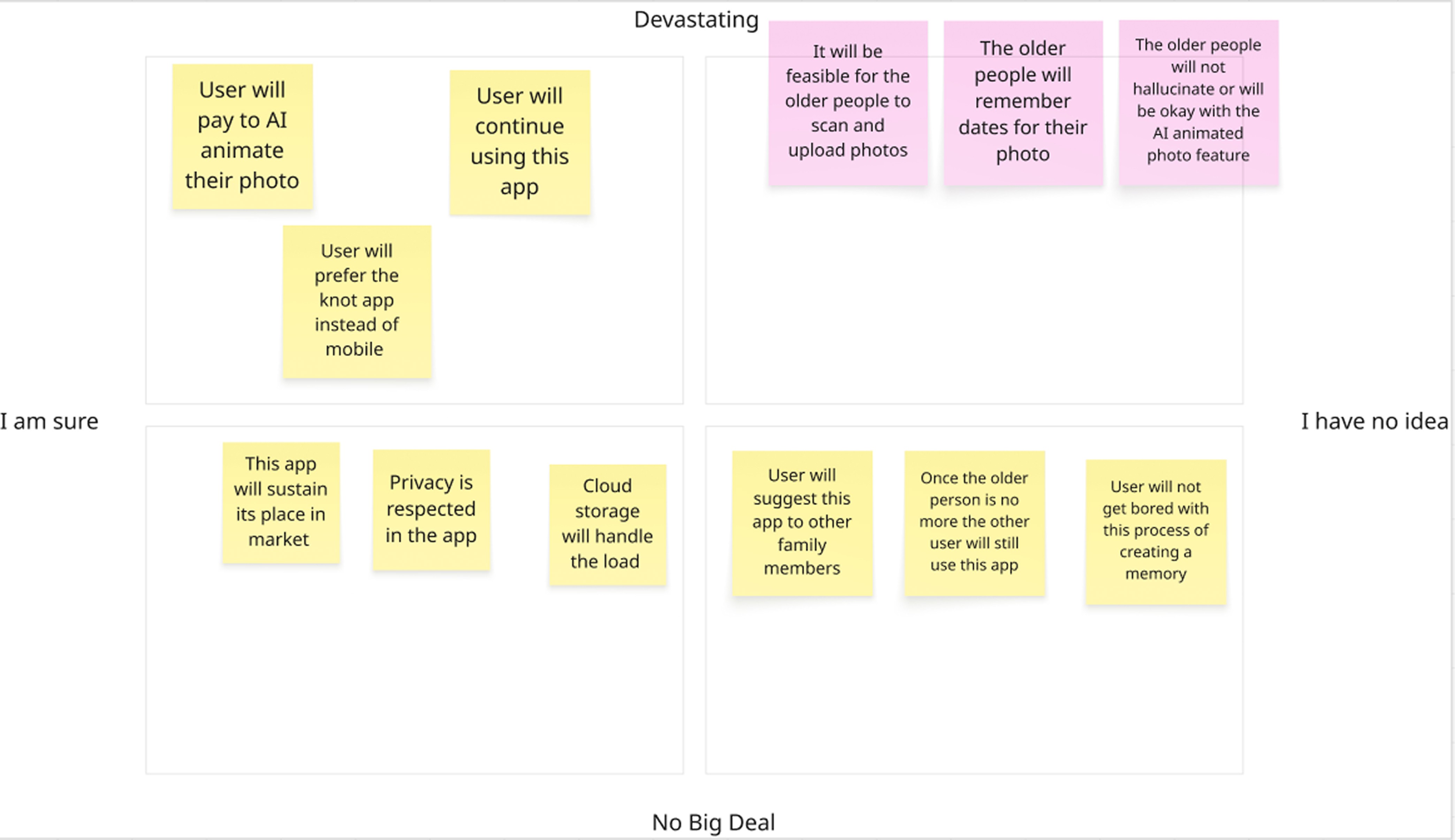
Three pretotyping experiments, each targeting one assumption identified as "devastating if wrong" in a risk matrix:
Pinocchio Test 1 (Scanning feasibility): 70% of 12 participants completed an unassisted photo upload task within 10 minutes, against a 40% threshold.
Pinocchio Test 2 (Contextual recall): No participant remembered an exact date. Every participant described the feeling in vivid detail. This single finding rewrote the metadata prompts from factual ("When was this taken?") to emotional ("What do you remember about this day?").
Fake Front Door (Market demand): A single landing page, shared through community channels, generated 47 waitlist signups in 72 hours, a 23% signup rate against a 15% threshold, before a single prototype screen existed.
Usability Testing
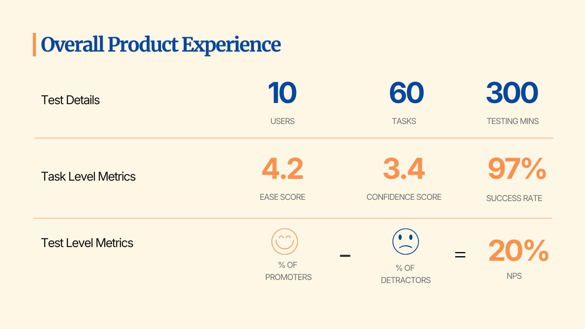
10 users, 60 tasks, 300 minutes of testing, moderated.
97% task success rate
4.2 ease score, 3.4 confidence score
5 of 5 participants had a visible emotional reaction to the AI photo animation. None was neutral.
20% NPS
Key fix shipped from this round: sign-up/login confusion (4 of 5 participants affected), now resolved by surfacing sign-up as the primary CTA.
Thesis Book